Delogue PLM · 2025

Delogue PLM · 2025

Designing Progression: Reframing a planning board around real workflows

From Complexity to Clarity:
Reshaping Information Architecture for Better UX

A sampling coordination board was organized by color categories - but teams think in progression. I restructured the board around actual workflow stages, replacing static labels with movable cards that mirror how work really moves.

Role

Lead Product Designer
within a product team

Scope

Information Architecture, UX Design, Service Design, User Research

Impact

Eliminated parallel tracking workarounds

Reduced coordination overhead between roles

Increased trust in the tool as source of truth

problem

When tools don't reflect real work,
people work around them

Understanding
the status-quo

The planning board grouped sampling work by color-coded categories. But sampling teams don't think in categories, they think in progression. Users had to mentally translate between how the tool was structured and how work actually moved. This led to parallel tracking in spreadsheets, repeated status checks across roles, and unnecessary cognitive effort. The system was logically organized - but behaviourally misaligned.

Uncovering navigation insights through workflow mapping and JTBD analysis.

Goal: Aligning the findings with our product vision and design principles

- Aligned product direction by collaborating with Customer Success and Sales
- Improved feature adoption through on-site visits and data-driven workflow insights
- Enhanced information architecture by identifying user logic via card sorting exercises.

before: behaviourally misaligned set-up

Uncovering navigation insights through workflow mapping and JTBD analysis.

Goal: Aligning the findings with our product vision and design principles

- Aligned product direction by collaborating with Customer Success and Sales
- Improved feature adoption through on-site visits and data-driven workflow insights
- Enhanced information architecture by identifying user logic via card sorting exercises.

overwhelming

Faster
Onboarding

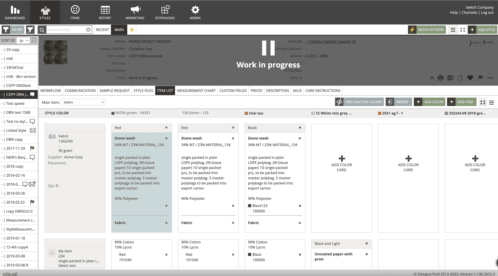
Unnecessary information distracted from the task at hand, causing decision fatigue.

misaligned

Boosted
Efficiency

The board's structure didn't match how teams actually tracked progress, forcing workarounds.

unreliable

Scalable
Design

Teams stopped trusting the board as source of truth, defaulting to memory and side-notes.

discovery

Understanding workflow reality
before touching the interface

Understanding
the status-quo

I visited customers on-site and interviewed teams during live coordination work.
What I observed: work rarely followed clean, linear states. Tasks moved back and forth between stages. Progress was understood through sequence, not labels. Teams relied on memory and side-notes to compensate for the board's limitations.

Uncovering navigation insights through workflow mapping and JTBD analysis.

Goal: Aligning the findings with our product vision and design principles

- Aligned product direction by collaborating with Customer Success and Sales
- Improved feature adoption through on-site visits and data-driven workflow insights
- Enhanced information architecture by identifying user logic via card sorting exercises.

Mapping the sampling workflow within the broader product creation ecosystem:

Uncovering navigation insights through workflow mapping and JTBD analysis.

Goal: Aligning the findings with our product vision and design principles

- Aligned product direction by collaborating with Customer Success and Sales
- Improved feature adoption through on-site visits and data-driven workflow insights
- Enhanced information architecture by identifying user logic via card sorting exercises.

key decisions

Three decisions that shaped the redesign

Understanding
the status-quo

decision

Replace categories with progression stages

Understanding
the status-quo

The problem: The board grouped work by color-coded categories (e.g., fabric type, supplier). But teams tracked work by where it was in the process - not what category it belonged to.

What I decided: I restructured columns to represent real workflow stages in the sampling process. Each column now maps to a meaningful step - from request to approval.

The trade-off: Losing the category view meant some users couldn't group by material type at a glance. But research showed that progression visibility was the primary need - and category filters could supplement without driving the layout.

Uncovering navigation insights through workflow mapping and JTBD analysis.

Goal: Aligning the findings with our product vision and design principles

- Aligned product direction by collaborating with Customer Success and Sales
- Improved feature adoption through on-site visits and data-driven workflow insights
- Enhanced information architecture by identifying user logic via card sorting exercises.

decision

Make cards movable, not static

Understanding
the status-quo

The problem: Work in sampling doesn't follow a clean, linear path. Samples get sent back, re-evaluated, or put on hold, but the existing board had no way to reflect this movement.

What I decided: Cards became draggable between stages, allowing users to reflect actual progress, including backward movement. The goal was not to enforce a process, but to mirror one.

The trade-off: Movable cards introduced the risk of misplacement and required clear stage definitions to prevent confusion. We mitigated this with confirmation states and audit trails.

Uncovering navigation insights through workflow mapping and JTBD analysis.

Goal: Aligning the findings with our product vision and design principles

- Aligned product direction by collaborating with Customer Success and Sales
- Improved feature adoption through on-site visits and data-driven workflow insights
- Enhanced information architecture by identifying user logic via card sorting exercises.

decision

Design for handover visibility,
not individual tracking

Understanding
the status-quo

The problem: Sampling coordination involves multiple roles: designers, sourcing, suppliers. Each person needed to know what happened before them and what comes next. But the board only showed current state, not transitions.

What I decided: I surfaced handover moments as first-class elements. Cards show who moved them, when, and what action is needed next, making the board a coordination tool, not just a status board.

The trade-off: Adding transition metadata increased card complexity. We kept it progressive - summary visible, details on expand - so the board stayed scannable while supporting deeper coordination needs.

Uncovering navigation insights through workflow mapping and JTBD analysis.

Goal: Aligning the findings with our product vision and design principles

- Aligned product direction by collaborating with Customer Success and Sales
- Improved feature adoption through on-site visits and data-driven workflow insights
- Enhanced information architecture by identifying user logic via card sorting exercises.

retrospective

from workaround to source of truth

Understanding
the status-quo

clear progression

Faster
Onboarding

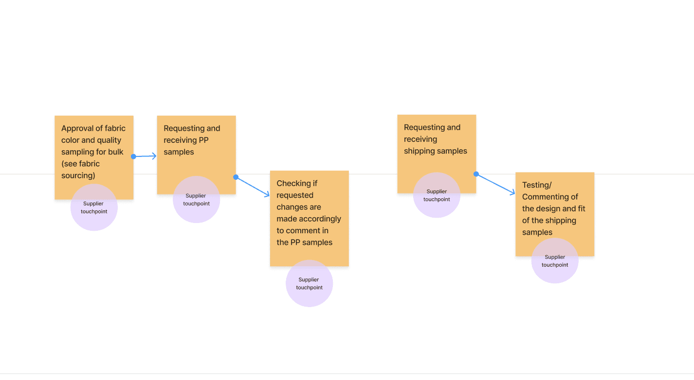
Teams could see where every sample stood at a glance, eliminating the need for parallel spreadsheets and status check meetings.

smooth handover

Boosted
Efficiency

Cross-role coordination improved as transition points became visible. Teams reported fewer "who's responsible?" moments.

greater trust

Scalable
Design

The board shifted from something teams managed around, to something that supported them. It became the single source of truth for sampling status.

key insight

"The goal was not to simplify the work - but to mirror it. By aligning the board with how work actually unfolds, the tool became easier to trust and easier to use."

Uncovering navigation insights through workflow mapping and JTBD analysis.

Goal: Aligning the findings with our product vision and design principles

- Aligned product direction by collaborating with Customer Success and Sales
- Improved feature adoption through on-site visits and data-driven workflow insights
- Enhanced information architecture by identifying user logic via card sorting exercises.

Charlotte Kleckers

Copenhagen